s. obobi
b.a hons media & communications


the color of memory


about

the idea
The Color of Memory explores how photographic narratives can convey a space's "story" or alter memories. For this project, I aimed to research how media manipulation can invoke certain emotions in the audience's perception of narrative flow and understanding of an individual’s storytelling. The aim was to understand the tools that illustrate history, memory, and personal significance to individuals in curated environments.
I interviewed candidates to ascertain their favourite pseudo-public spaces with an air of positive sentimentality. Through telling their
In personal narratives, the aim was to photograph them “en stage” and manipulate the coloring in post-production to see how it affects the audience’s perception of the narrative. To avoid stimulating negative emotion/memory, the memory would be of a happy, wistful, nostalgic, etc, essence. The aim was to draw comparisons to ideas such as mise-en-scene in film or how gaming developers partake in worldbuilding.
conduct manipulations on the color. Afterwards, I recalled the same interviewees and had them recount how the new image makes them feel, and describe how the memory has shifted under the newfound alterations.


project management
formal elements of the project
proposal
creative output


proposal version 2


secondary scheduling

.png)
proposal feedback

additional feedback

final proposal


ethics form


proposed gantt chart

updated scheduling

acquiring interviewees


risk assessment


 |  |  |  |
|---|---|---|---|
 |  |
project management
Within the project management, I had to piece together a lot of formative documents to even get the ball rolling. Getting my feet off the ground took quite a lot of trial and error in terms of the initial idea. In terms of display, it is clear to see how many proposal drafts I went through, the schedule, and adjusting my work to the flow of the day-to-day intrusions. But in the end, it came together effectively/efficiently and helped to make my research/design process so much easier and attainable.


step-by-step outline of the project development from proposal submission to the final presentation

initial idea

The initial idea I had was to do a similar project within psuedo spaces and edit the images and the distort the mise-en-scene. This is how I was able to create the creative output. Within my creative research, I wanted to explore how this might a person's memory/understanding of a situation. Due to a lot of my favorite films, and a affinity to learning about memory, i thought to explore this topic. A lot my life I remember in concordance with certain films, colors, and themes, so I wanted to put a creative spin on this.
initial
proposal
Within the initial proposal, I had three main ideas for how I would aim to explore this thesis. However, I was a bit indecisive. I ended up deciding to explore presenting the project in terms of a documentary-style film. However, with advice from my supervisor. I narrowed it down to a Photography Exposition.

.png)
I decided against doing a zine, because it would be more impactful to do a "before & after"/ "cause & effect" style of presenntation of the initial images vs the final results, as well as how the interviewees reacted to images.
proposal
submission
supervision 1
Within the proposal, I was about to narrow down 3 ways in which I wanted to present my project. However, I did not come up with a stationary hypothesis for this project. I just wanted to explore this thesis with an open-ended version of what the results may be.

research time

While researching, I came across several practice-based projects with similar methodologies. I started to construct/imagine the layout of the project. However, I did notice some difficulties in terms of establishing this project. It was hard to narrow down in terms of the project what I would be utilizing to manipulate as "mise-en-scene." The category as a whole was too broad, so I ended up narrowing it down to color. Then I had to narrow down the number of participants I had, from my projected 20, to about 5.
I spent a large amount of the winter break trying to nail down and further reduce the criteria for participants, criteria for editing, what type of presentation formatting I wanted to use, interview questions,and made the effort to start reaching out to interviewees to begin the process.
Go to the research & application section to see which references I used.


After my proposal submission, I had a 1-to-1 supervision with my advisor, Alnoor, and he gave me advice on continuing to narrow down the margin of research in terms of what I wanted to research how to present that. He encouraged me to look at examples of films where this kind of practice was used. Especially since I was still debating which formatting I wanted to use. As well as look at specific cinematography styles. I had to question what the margins (limits) would be in what I created?
i.e; After Life (1999)
crits
I had my first crits session and recieved feedback from several peers/supervisors that gave me crusturive criticims on not just how I might present the work in the final stages, but also about the shaping/framing of the work research as a whole. At this point in time, I had not yet interviewed anyone for the project, as it was scheduled in for later down the line.
One of my classmates suggested that, since I wanted to utilize the brain as the structure. Instead of having it stationary placed on a wall. I could create a 3D structure that is divided into several parts. Each part would correspond with a different candidate. Or I could explore modeling different before/after or transitional editing and gauge reactions from those layouts. At first, I was not going to heed the advice, because I couldn't see the practicality of it. However, later on in my researching/planning, it started to make more sense to present it that way.


interim exhibitions
At this stage, I created what I perceived as a "trailer" for my project. After receiving some feedback, it was not quite as strong as I hoped. I hoped to elicit the feeling of Inside Out (2015) with the memory orbs. I even utilized the character Joy's hand, as it may have been a helpful visual stim. I tried to communicate the memory being recorded in a visual space. That way, a person seeing the exhibition for the first time might interpret the imagery that way. However, it did unfortunately fall flat.
interim report


supervisions 2
I was still trying to figure out how best to recover at this stage in terms of the presentation. So the next thing I was able to turn to was writing my interim report. I received feedback that helped me further/nail down the key items of the project and started to figure out more ways to present the imagery.
I added more visual references, as my project was more visual. So artists/curators/photographers like William Eggleston & Sophie Calle helped to inspire my work. As well as some of my favorite films.
I created my interim report and submitted it to my supervisor for criticism. Within the report, I broke down the research that I studied, which delved into depth about the effect color has on memory. As well as what effect it has when it transfers from the physical/digital form to the parts of the subject's brain. The report broke down the photographers, artists, and visuals that helped illustrate my project, as well as the intended final outcomes.
interviews round 1

editing
After the completion of the preliminary rounds of interviews, I started to take the images into post-production, and from there I used the researched editing style to help minister to each photo. I aimed to edit each separate interview in a different cinematogrpahic style in order to ellicit a plethora/differentiation of responses.
So, depending on the image, I tried to work within the natural elements of the photo.
I.e, a photo with over-exposed light, how can I shape the imagery, and where am I going with it?


I contacted each of the interviewees from the start of February to mid-March. I conducted each of the individual pre-production interviews at the earliest time of convenience for the subjects. Without our correspondence, we thought out the best days/times where weather and other factors may cause issues.
post-production interviews


drawing conclusions
After conducting the second round of interviews, I had the participants submit the second round of responses. Due to the fact that I didn't need to gauge their physical reaction to the photos, I conducted the second round of interviews through correspondance.
From there, I compiled their responses in a spreadsheet to see how they differed/compared and started adding them to their individualized presentations.
final stages
With the completion of the digital hemisphere. I started creating the final physical presentation pieces for the exhibition. With the idea of creating a large brain, the aim was to 3D Print/ start creating the physcial exhibition to showcase the results of each of the individualized stories.


After completing all the post-production edits, I was able to send out the final versions of the prints to each of the participants. to receive feedback and their thoughts. I conducted the post-production interviews through correspondence. I did not give any metrics of how I aimed for them to respond. To go into depth, to be brief, etc. I wanted them to respond with the most authentic answers to themselves.
final execution curation
With the collection of all the digital elements curated on this portfolio. I was able to create a holistic identity for this project with the stories and the art I was able to create thereof. I met with some of the advisors within the different programs to figure out how best I could be able to come up with the 3D model for presentation. I aimed to do it through 3D printing.

project progression

color

When I first started this project, some of my favorite films inspired me to explore cinematography and coloring. The best way in which I can manipulate color. Some of those films were projects like La La Land, Euphoria, & Waves. These projects, all individualistic within themselves, have different ways in which they use color to push narratives, or aid narrative flow.
la la land
research done for the development of the project

Within the film La La Land (2016), color is utilized to explore emotions. One of the things the film does very brilliantly is split the film into two distinct, conspicuous acts. It shows very clearly where there is a distinctive shift in the narrative. Within this shift, it is very noticeable to see how the coloring, especially when it comes to the clothing tones of the characters, shifts dramatically in a parallel motion to their emotions. When a character is more distressed/saddened. Their clothing becomes paler in nature. As well as the opposite end of the spectrum. Happier emotions illicit more bold, louder colors.
As well as the fact that the most tense the situations would get would still illicit vibrant hues, however, they have more calm tones, with less saturation.


waves
Waves (2019) has a very similar structure to La La Land. The film is divided into two very distinct narrative acts following a brother & sister. Each act follows a different sibling, and their emotions are often amplified by the coloring of the scenes.
One of the major distinct features of this act change is that the first brother starts in a world full of color, which reflects his mood. As the storyline progresses, things take a turn for the worse. Which causes the coloring to start to shift and become dimmer in nature. Hues such as reds and oranges start to stand out more vibrantly as the character's mood gets heightened. When the film reaches the climax, where a horrible act is committed, the narrative shifts to his sister's POV. From there, the sister's POV is informed by the repercussions of her brother's actions. Due to this, the coloring starts duller and becomes more vibrant as her mood starts to improve.
euphoria
Euphoria (2019) takes a different methodology when it comes to cinematography. Each character is unofficially assigned a color that will change with the changing of their moods. As depicted below, Jules (Hunter Schaefer) is a character newly introduced into the neighborhood and is depicted with bright pink hair (top picture). In the picture below, Jules' hair has faded as the mood has shifted for the character. This shows how the dulness of the mood has changed for the character.
This happens "unofficially" which each charcarcter. Along with the rest of movies; the coloring of the films helped into inspire my own work within cinematography and coloring.


influential photographers
& artists


Some photographers that influence my research are William Eggleston, Cindy Sherman, Nan Goldin, and Saul Leiter. Known as pioneers in the Photography realm, their work has not just helped to shape my practice, but also my research. As Photographers who have a special affinity to color, but explored in different facets, it was useful to explore their work and how it influenced my practice corporately, as well as individually.
William Eggleston – who is known for his work in pioneering work in color photography. He specializes in drawing you vivid colors in the spaces that were visually “plain.”
Cindy Sherman – A photographer known for her use of color manipulation in order to explore identity and perception, offers a glimpse into how color can affect recognition, recall, and resonance.
Nan Goldin – A photographer known for her use of nostalgic color palettes can help to strengthen memory association.
Saul Leiter – Leiter utilizes dimension within his work in order to build meaning. Through the layering of paint, he was able to utilize color to shape narratives.
 |  |
|---|---|
 |  |
 |  |
artistic works on color
& memory


Olafur Eliasson - Room for One Colour (1997)
Olafur Eliasson – Eliasson utilized his installations to alter perceptions, which will help to inform how I used color through photography to do the same.
Sophie Calle—In her work, she was known to use conceptual photography to create further depth with memory and identity.
Annie Ernaux - Though not a visual artist, Ernaux effectively created a very visual language emphasizing sensory stimulation.


A Woman's Story (1988) - Annie Ernaux

Olafur Eliasson: Within my research, I aimed to search for artworks/exhibitions that already existed within the creative space. So when I came across these pieces. It helped me shape my work more efficiently. I wanted to explore different styles of using color, but not only in how it might translate through the digital hemisphere in the photography aspect. But also, how it could translate into an exhibition/installation space. Within the usage of color within Olafur Eliasson's spatial technique, it prompted me to ask questions about how I could utilize coloring within the exhibition spacing.
Sophie Calle: As I explored the depth of concept, especially in black in white photography, I wanted to see how I could potentially draw attention to certain aspects of an image. Would more depth come from a pop of color? From a lack of color, but more importantly, how could I draw this out/emphasize it? Sophie Calle's work was a big inspiration for me in this project. Within her untitled art piece displayed to the left, there are dimensions drawn from the lack of color. I thought about how I might be able to integrate this into my artwork.
Annie Ernaux:
Unlike the rest of the examples, Annie Ernaux's work is literary in terms of physical vision. I was inspired by how works evoke emotions, but how sensory the descriptions are within her work. Though her work is a bit older, it has a long-standing reputation for being renowned for how it appeals effectively to the senses. I aimed through the usage of the visual aids I had within color, I would be able to invoke the same kind of reaction. Within the interviewees, as well as the audience of the overall exhibition. I utilized two of her books: A Woman's Story - a book about a tumultuous journey of a daughter aiding with her mother's alzheimers and La Place, which is about Annie Ernaux writing about complex relationships with her father, and struggles of leaving working-class life.
Untitled - Sophie Calle
La Place (1983) - Annie Ernaux
research & progression


practical competence in the chosen media and relevant use of appropriate technologies
project in practice
image creation

As mentioned in my interim report, I aimed to edit the images in 5 distinct ways to receive differing feedback. So, to do the best I could do in terms of each style and what I hoped to accomplish, I used a plethora of different editing platforms for each image. Including Canva, Photoshop, and editing software on my cellular device.
I narrowed it down to:
1. Warm-toned
2. Cool-toned.
3. Black & White
4. Vintage
5. Nostalgic/Isolated

I did not use specific coloring metrics when it came down to the actual effective editing of this project. However, I did use reference photos for the effect I essentially wanted to create within a specific photo, without reneging on my styles within each of the final photos.
For photos like this example. I aimed to create a vintage style feel that explored color and color depth, which then created meaning. The original image (figure 1), which is not edited, except in color aspect, was shot with a blurred camera lens. I aimed to use a stylistic color similar to how euphoria & waves did their technique. Capitalizing on the use of color hue as well as saturation to draw more attention to the subject of the photo, as well as the emotions captured in it. Much like the way William Eggleston utilizes spaces that are like "hidden gems," or not seen as overly visually pleasing, this is the type of coloring that I tried to emulate within my style.


figure 1
exhibition curration
figure 1 - reference photo
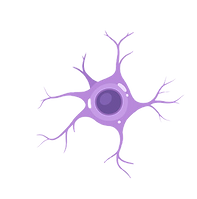
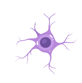
When I first started this project, one of the main ways I had tackled assembling this project was how I planned to present it in an open space. As the project focuses on memory and where it stems from, I had an idea. Brain Stem and how it branches off the main Brain Tissue. I came up with the idea of creating a 2D model of the brain, and having the "neurons" track to the main brain stem. At the end of the neurons would be the images before and after, and how the interviewees reacted to the post-production images.
I started by creating/researching several different styles of the brain, how it is laid out, and the best way to represent it. From there, I wanted to transform the original 2D model I was able to create at the Crits exhibition and create a 3D version by 3D printing a large model.
From there, the model would be cut vertically and hung from the wall, and connected in the same way as the original crits model. So throughout the course of the research process, I came up with a plethora of different ways to present the final model.
.jpeg)
Through the planning and creation of this exhibition space, I was able to reach out to staff members and explore editing software to create the best version of the 3D brain. I did have some troubles when it came to finding the correct material, but I was able to start putting the work together to create the dimensions of the planning I hope to achieve.
During the planning , I was able to utilize tools such as Bing Image Creator to mock up possible layouts for the setup and see how it might best be displayed.


The aim is to create a web of sorts, as shown in the diagram. I aimed to create essentially a brain web. The memory centre/core is in the middle, with the neuropathways branching off the ends of it. As well as the Large images being attached to the end of the neuropathways. This was it would look like a large spiderweb system.
research exhibition
Within the course of the planning, I had the opportunity to submit my work to the Graduate Research Hub. While I did not get accepted into Hub, it did help me further shape and develop my research. I was able to use the development to add to the development of my presentation. So I was able to come up with an assortment of different styles of presentation for the exhibition.
As well as different stages within the overall process that allowed me to present the work. Though in the end, I did not end up going with the adaptations/changes made in terms of the project work. These steps were very effective in helping me lay out the groundwork for my intended final income and how I sought to lay it out.


final installation layout


final outcomes of the project that will be later exhibited on the final year exhibition
Bhavna Ponvalavan describes the first memory how she came across Jenki Matcha in Liverpool St.
Do the changes made to the pictures captured change the meaning of this space for you?
Does it hold the same sentimental value, or has it changed in some way?
Do you feel as if the aura from the original space translated through the new picture?
How did you envision this memory in your head? Does it differ from what is translated on screen?


1. Slightly, the edits do shift the mood of the space . It doesn’t necessarily change the meaning entirely, but it does create a more reflective perception.
2. It still holds sentimental value, but the emotion tied to it feels different now. The edit makes it feel more reflective like looking back on a memory rather than being in the moment.
3. Only partially. The original space had a more open and warm energy, while the vignette and darkened tones create a more dreamlike atmosphere.
4. I envision this memory being a bit no dating , the edited picture makes the moment look cinematic

Zavier Achiampong describes his summers at the park, where He grew a fondness of coming to exercise & decompress.
Do the changes made to the pictures captured change the meaning of this space for you?
Does it hold the same sentimental value, or has it changed in some way?
Do you feel as if the aura from the original space translated through the new picture?
How did you envision this memory in your head? Does it differ from what is translated on screen?
_JPG.jpg)

1. Yeah, it does a bit, it makes me think more sentimentally of it, cause the photo makes it seem like a happier memory than just a memory.
2. It changed as above because it’s been made to feel warmer, and there’s a smile in the photo, I guess...
3. Warmth and fondness are conveyed, but I also felt cold memories just cause I’d be there in the dark in the winter too when it was cold
4. I thought it was mostly filled with solitude but there’s more warmness I see now.
Fabio Gentile describes the scene in which he first met his best friend and his girlfriend.
Do the changes made to the pictures captured change the meaning of this space for you?
Does it hold the same sentimental value, or has it changed in some way?
Do you feel as if the aura from the original space translated through the new picture?
How did you envision this memory in your head? Does it differ from what is translated on screen?


1. The edits definitely changed the way I see the space It still feels familiar but the black and white background makes it feel more distant and quiet The focus is clearly on me now and that changes the meaning a bit It becomes more about the feeling of the moment than the place itself
2. It still holds sentimental value but in a different way Before it was about being in that café with all its sounds and colors Now it feels more like a memory of how I felt there relaxed happy and present
3. Some of the original feeling is still there especially in the expression and the light but the atmosphere has shifted It feels calmer and maybe a bit more nostalgic
4. In my mind I remember this moment with a lot more going on the people around me the warmth of the café the little details The edited photo is simpler more focused It does not match the memory exactly but it captures the emotion in a special way.
Ayo Adelagun describes memories with his best mates at a Popeyes

Do the changes made to the pictures captured change the meaning of this space for you?
Does it hold the same sentimental value, or has it changed in some way?
Do you feel as if the aura from the original space translated through the new picture?
How did you envision this memory in your head? Does it differ from what is translated on screen?

1. Yes, they do. I think the way that certain hues have been further exposed makes it hit a lot harder and makes it seem like my feelings at the location selected are being fully portrayed, just the way I have them in mind.
2. Yes, it does hold sentimental value to me and I would definitely say it has changed but for the better. The lighting’s heavier and emphasis and detail are placed on the parts that stand out the most in my memory. It’s almost as though I’m seeing it how I would see it in my mind, which is most ideal. I can resonate with it more now and it fully captures my mood in that space.
3. Yes, most definitely. The original picture captured the idea, but the new picture takes the emotions into full consideration and shows them a lot clearer, with more vibrant colouring and overall a more familiar tone.
4. No, not at all. I think Selali’s done an excellent job in replicating the imagery of the space, as I would have it in my mind. In my memory, the colours were a lot sharper and warmer and she’s been very effective in conveying that.
Sanjna Ayyagari describes her first memory in London with her parents.
Do the changes made to the pictures captured change the meaning of this space for you?
Does it hold the same sentimental value, or has it changed in some way?
Do you feel as if the aura from the original space translated through the new picture?
How did you envision this memory in your head? Does it differ from what is translated on screen?
_JPG.jpg)

-
No, I feel as if the changes enhance the beauty of covent garden as well as capturing the happiness this space brings to me without altering the meaning of the space for me, it more so enhanced it.
-
It still holds the same sentimental value, because it does still remind me of the happiness this space brings, as well as the time spent there with my dad
-
Yes, I feel that the vibrant and lively atmosphere is captured very well through my energy in the phot,o as well as the edits made, capture the warmth and charm of the space
-
I feel as if the picture captures warmth and excitement which is what I envision thinking about this area and the memories had here. It is a space I associate with spending quality time with friends and family. Seeing this visual, I feel my joy is captured very well and shows the joy I feel whenever being in this area.


project in presentation


acknowledgments

many thanks
Genesis 1:1 reads, "In the beginning God created the heavens and the earth." One of the first things YAHWEH is established as is creator. Because I am created by Him, I can be creative, therefore, I owe every creative piece of this project to the one who came first. Thank you, Lord.
I would like to recognize all my advisors/supervisors for the help they contributed to this process. But especially to Alnoor Dewshi and David Waterworth. A lot of this project started to come together at the last minute, and it was because of their input that helped to make it better.
I want to give a special shout-out to all of my participants/interviewees. Thank you for allowing me to invest and share your stories. Without you all and your vulnerability, this project would be nothing. Thank you to Ayo, Zavier, Sanj, Bhavna, & Fabio for entrusting your stories to my care.